 Data analyst and Regen’ design lead
 A series of short stories:
On the concepts behind our Energy Generation in Wales in 5 minutes document.
Last year we produced a brilliant report, known as ‘Energy Generation in Wales’. It is beautiful in design and extensive in detail. This full report charts the Welsh Government’s progress towards their energy policy targets, both in local ownership of energy generation, and in renewable energy capacity. To accompany it, we have recently produced a graphical summary document, ‘Energy Generation in Wales in 5 minutes’.
First of all, please read our Energy Generation in Wales in 5 minutes document!
This blog is intended to illustrate some of our aims and desires in creating the document.
The concept of our in 5 minutes document is to explain as much as possible, in as few words as possible. We wanted to engage the casual curious and the energy enthusiast alike, to show the technological and spatial nuances in Wales, and highlight the progress made against policies to date.
Sometimes a lot of data processing and detail would prevent the proper story being told. The narrative might get lost, and the plot thins. Alternatively, it’s as easy to go too far the other way, to summarise and simplify in an attempt to get to the end before having begun. I think our documents show that this needn’t be the case, and that the dry data behind the pages is brought to life in full depth and colour, without over-simplification. Though, you’ll have to read it to decide for yourself.
A walkthrough example from the in 5 minutes document:
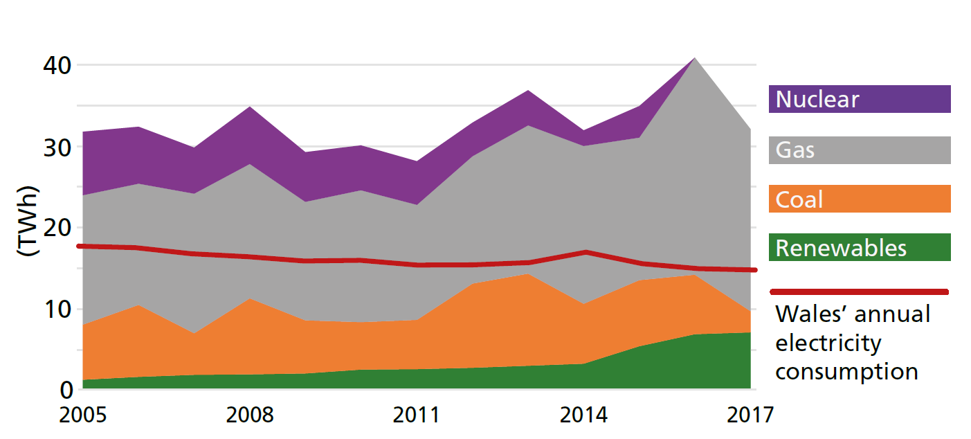
The image below is on the first page and tells several stories at once. It shows total energy generation in Wales every year since 2015, and stacks four technology types, plus electricity consumption, across the period. It is appropriate for an introduction page as it serves as context for the rest of the report.
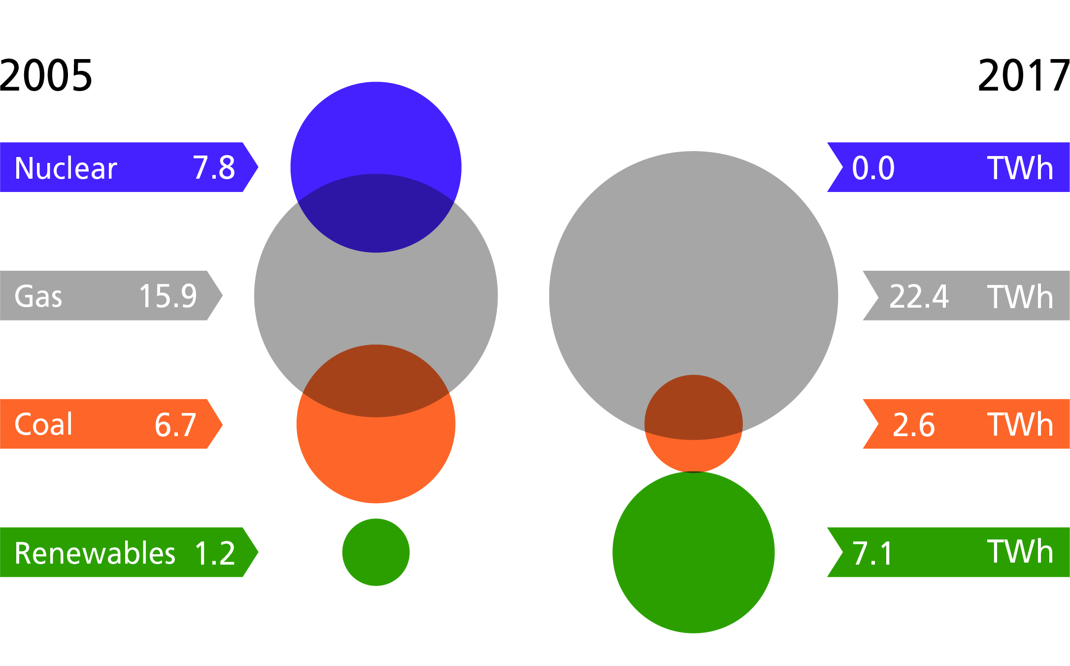
However, for the rest of the report we want to tell a series of separate short stories that begin and end within one image. The next image is the same data (energy generation over time) but is telling a much simpler story. Each technology can now be read individually, with the overall trend obvious at first glance. This is straightforward, but not over-simplified; complete, without over-complexity.
I hope that this short example illuminates the ideas we had when illustrating the story of energy generation in Wales. There are a number of relevant reports being written and published all of the time, the most impactful however are those that are both easily digestible and evidently data-driven. This is what, in our own humble 8-page A5 document, we have attempted.
We are publishing Energy Generation in Wales 2018 and the sibling in 5 minutes report in the Autumn of 2019.
____
Frankie Mayo